Website development services encompass a comprehensive suite of professional solutions designed to address the intricate requirements of businesses in the digital age. These services go beyond the mere creation of websites; they encompass the entire journey, from meticulous design and development to ongoing maintenance, ensuring that your online presence remains a dynamic and effective tool for achieving your unique objectives. At their core, website development services are a blend of creativity and technical precision, shaping not only the visual aesthetics of your digital space but also the functionality that underpins an intuitive and engaging user experience. With the digital landscape constantly evolving, it’s crucial to have a web presence that not only captures the essence of your brand but also adapts to the ever-changing needs and expectations of your audience. That’s where professional website development services become invaluable, providing a roadmap to digital success, a foundation for innovation, and a dynamic platform for connecting with your audience. Whether you’re starting from scratch or looking to revamp your current website, choosing the right web development partner is a critical decision for your business.
What is the Difference Between Web Development and Web Design?
Web design is a creative process focused on the visual elements of a website, going far beyond the mere aesthetics. This encompasses the layout, color scheme, typography, and the overall aesthetic appeal of a website. Web designers are the artists who skillfully blend these elements to create not only a visually appealing but also a user-friendly website. Their primary goal is to craft a digital space that effectively communicates the brand’s message, resonates with the target audience, and leaves a lasting impression.
On the other hand, web development is a more technically oriented discipline, delving into the nuts and bolts of a website’s functionality. It’s about building the website’s backbone infrastructure, ensuring smooth and efficient performance, and enhancing its security. Web developers are the architects who use programming languages such as HTML, CSS, and JavaScript to create websites that are not just visually appealing but also highly functional and reliable. They breathe life into the design by bringing it to action.
Though there is some overlap between web design and web development, they remain distinct disciplines that require unique skill sets. A successful website is often the result of a seamless collaboration between web designers and web developers. This partnership ensures that the website not only looks great but also functions smoothly, catering to the user experience, and is optimized to rank favorably on search engines. These two worlds converge to create a digital masterpiece that marries artistry with technical prowess, delivering a website that is both visually stunning and impeccably functional.
Why Choose Webolutions for Your Website Development?
Choose Webolutions Digital Marketing Agency in Denver, Colorado as your trusted partner for website development, and unlock the full potential of your digital presence. Our expert team combines artistic creativity with technical precision to craft websites that not only captivate your audience but also deliver seamless functionality and exceptional user experiences.
Creative Expertise
Artistic Precision: Webolutions excels in infusing unique creativity into every aspect of website development, ensuring that your digital presence is not only functional but visually captivating as well.
Technical Mastery
Efficient Functionality: We possess the technical prowess to build robust infrastructures, implement features, and optimize performance, resulting in websites that are not only beautiful but also highly functional.
Proven Success
Track Record: With a history of successful projects, we’re a trusted partner dedicated to creating online platforms that meet your unique needs, resonate with your audience, and drive tangible results for your business.
Testimonials
What people are saying
Webolutions provided a great service and gave our brand a new life! The team was great to work with, our new website looks amazing, and our new branding and messaging is right on. Highly interactive. No surprises. Great value.
Nick Callaio
Marketing Manager, Safe Harbor Financial
Testimonials
What people are saying
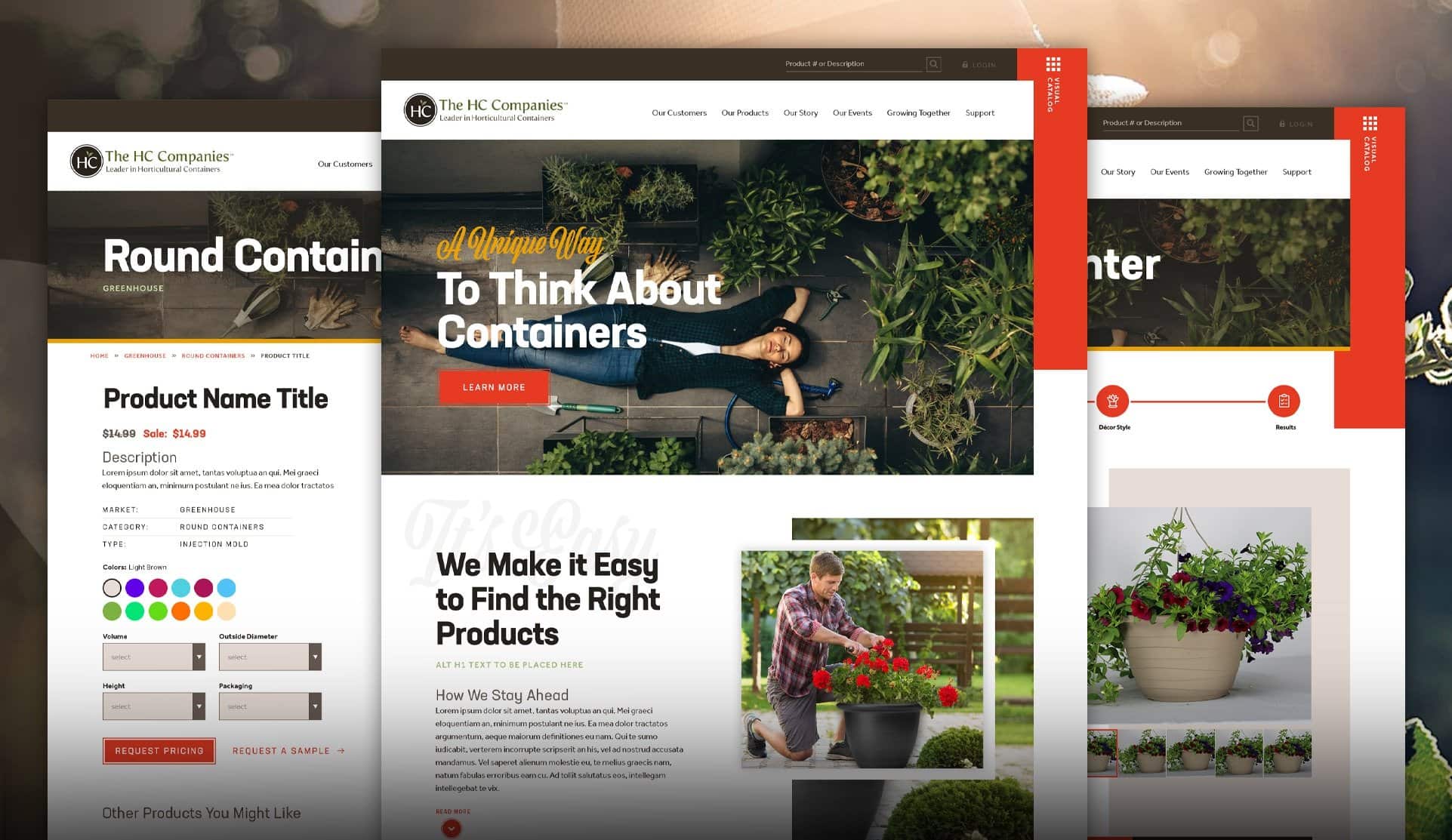
I wasn’t just thinking I was just buying a website. I was looking for something that could disrupt the industry. That’s exactly what Webolutions delivered.
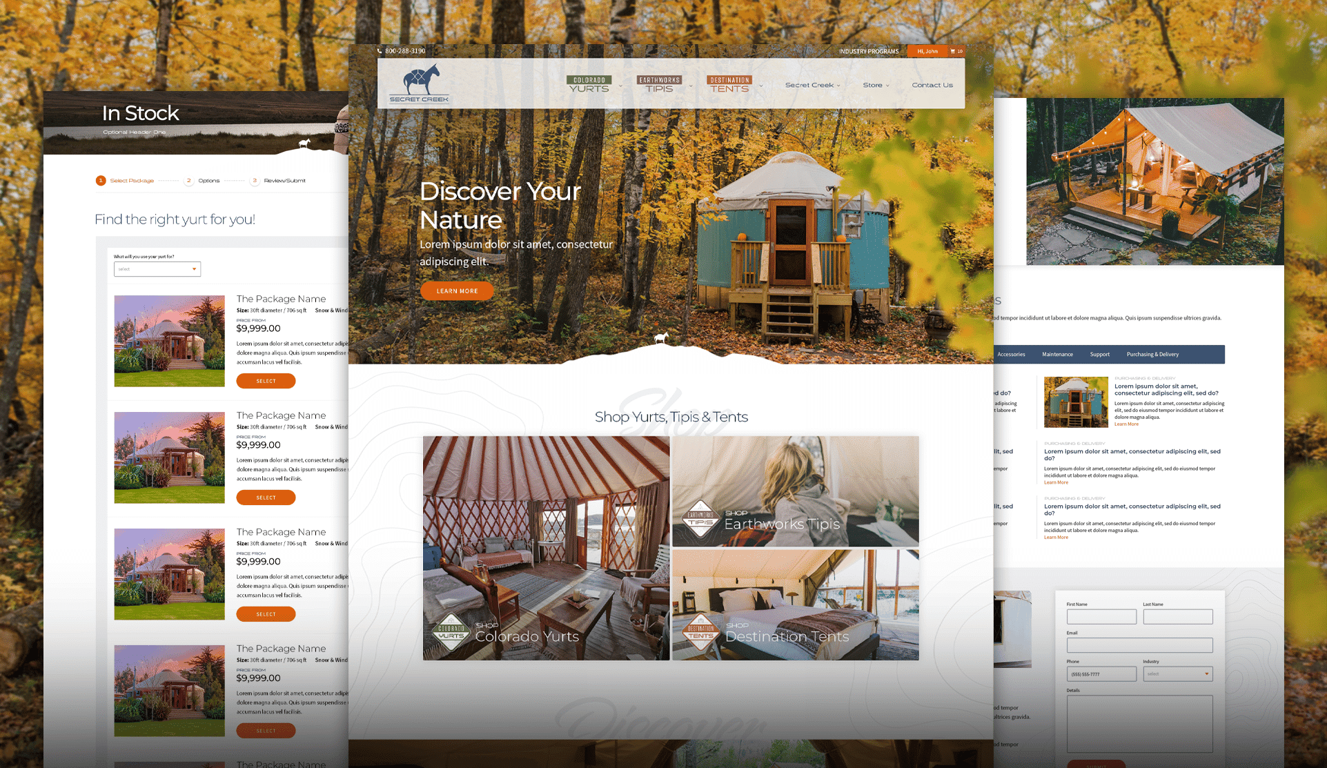
Craig Ruvere
Marketing Manager, The HC Companies
Testimonials
What people are saying
Their ability to develop a functional yet stylish website that can also generate traffic and conversions is uncommon and sets them apart.
Janel Kane
Digital Marketing Manager, Avantes
Testimonials
What people are saying
The website turned out exactly as we envisioned it. Webolutions did everything we asked. Project management communications were prompt, proactive, and meaningful.
Jason Lehman
Marketing Manager, FUSA Insurance
Testimonials
What people are saying
We’re a long-established nonprofit but this was our first major web development effort. We needed a partner to guide us through the process and help us learn as we go. Guidance was comprehensive, communication was timely, and our dispersed and diverse staff gained comfort with Webolutions every step of the way. For anyone seeking this experience, we recommend Webolutions 100%.
Erin Barber
Executive Director, National Center for Higher Education Management Systems (NCHEMS)
Get Your Free Proposal
Pick an option below and get connected to one of our web develpment experts.
Why is website development important to my company?
Having a strong online presence is crucial to your company’s success. A website is not only a digital representation of your brand but also a platform for engaging with potential customers and generating leads. Here are some reasons why website development is essential for your business:
Customization: A website development company can create a website that is tailored to your business needs. With their expertise, they can help you create a website that effectively communicates your brand’s message, showcases your products or services, and provides a seamless user experience.
Functionality: A web development agency can build a website that is optimized for functionality. They can help you incorporate features like online booking systems, e-commerce functionality, and lead capture forms, all of which can help you generate leads and increase revenue.
Scalability: As your business grows, your website needs to evolve to meet new demands. A web development agency can help you scale your website to accommodate new products, services, or markets. They can also help you optimize your website for high traffic and ensure that it can handle increased user activity.
Security: A website development agency can help you ensure that your website is secure and protected from cyber-attacks. They can implement security features like SSL certificates, two-factor authentication, and regular software updates to keep your website safe from hackers and other online threats.
Search engine optimization (SEO): A website development company can help you optimize your website for search engines like Google. By implementing SEO techniques like keyword optimization, backlink building, and content creation, they can help you increase your website’s visibility and attract more traffic.
Website development is crucial for medium to large businesses to stay competitive in today’s digital landscape. While you may have an in-house team that handles website development, hiring a website development agency can provide additional expertise, resources, and scalability. A web development company or agency can help you create a website that is customized to your business needs, optimized for functionality and performance, and secure from online threats. They can also help you implement SEO strategies that can increase your website’s visibility and attract more customers.
What are the Various Aspects of Proper Website Development?
Custom web application development, ecommerce development, technical requirements, wireframes, mockups, and QA testing are important aspects of web development that can benefit your business:
Custom web application development: A custom web application can help you streamline your business processes and increase productivity. Whether it’s a custom CRM system or an online booking platform, a web development company can create a web application that is tailored to your business needs.
Ecommerce development: If you’re looking to sell products or services online, ecommerce development is essential. A web development company can help you build an ecommerce platform that is optimized for sales and user experience, and can help you integrate payment gateways and shipping options to streamline the purchasing process.
Technical requirements: A web development company can help you navigate the technical aspects of web development. This includes ensuring that your website is optimized for performance and speed, is compatible with different browsers and devices, and is built using the latest technologies and programming languages.
Wireframes: Before building a website or web application, a web development company will create wireframes that outline the layout and functionality of the site. This allows you to see how your website will look and function before any coding takes place, and provides an opportunity to make changes and revisions before development begins.
Mockups: After wireframes are approved, a web development company will create mockups that provide a more detailed visual representation of the website. This can include color schemes, typography, and imagery, and provides a more accurate representation of what the finished website will look like.
QA testing: Once development is complete, a web development company will conduct QA testing to ensure that the website is functioning properly. This includes testing for bugs, broken links, and usability issues, and ensures that the website is ready for launch.
Custom web application development, ecommerce development, technical requirements, wireframes, mockups, and QA testing are all important aspects of web development that can benefit your medium to large company. A web development company can help you navigate the technical aspects of web development and create a website or web application that is customized to your business needs. By building a website that is optimized for performance, user experience, and functionality, you can enhance your online presence and drive more business to your company.
What is Custom Web Application Development?
Custom web application development is the process of creating a web-based software application that is designed specifically for your business needs. It can range from a simple system for managing customer data to a complex platform for running your entire business.
There are several reasons why you might want custom web application development for your company. First, it can help you streamline your business processes and automate tasks, making your operations more efficient and saving you time and money in the long run. Second, it can provide you with a competitive edge by giving you unique capabilities and functionalities that are tailored to your business needs. And finally, it can improve your customer experience by providing a seamless and intuitive online platform for them to interact with your business.
A web development agency can be a valuable partner in custom web application development for several reasons. First, they have the technical expertise and experience to build complex web-based applications from scratch. This means they can provide you with a solution that is truly customized to your business needs. Second, they can help you navigate the complexities of web development, such as choosing the right technology stack, managing databases, and ensuring security and scalability. Finally, they can provide ongoing support and maintenance for your application, ensuring that it continues to meet your business needs and stays up to date with the latest technology and industry standards.
Custom web application development can provide significant benefits for your business, including increased efficiency, competitive advantage, and improved customer experience. A website development company can help you navigate the complexities of web development and create a custom application that is tailored to your business needs. By partnering with a website development agency, you can ensure that your web application is built to the highest standards and provides maximum value for your business.
Get Your Free Proposal
When it comes to web development, Webolutions stands as your strategic choice for forging a dynamic and highly functional online platform. Our exceptional expertise seamlessly blends technical prowess with creative innovation, ensuring that each website we craft not only captivates your audience but also delivers flawless functionality. With a track record of consistently exceeding expectations, Webolutions has been a trusted partner in realizing businesses’ digital aspirations. If you’re in search of a web development team that comprehends the intricate nuances of the digital realm and is passionately committed to elevating your brand’s online presence, take the first step today and get in touch with Webolutions to unlock the true potential of your digital future.
Ecommerce development is the process of creating an online store or platform that allows your customers to purchase your products or services online. It can include features such as product catalogs, shopping carts, payment gateways, and order management systems.
There are several reasons why you might want ecommerce development for your company. First and foremost, it provides your customers with the convenience of shopping for your products or services from anywhere, at any time, which can increase sales and revenue. Second, it can help you expand your customer base beyond your local area and reach customers all over the world. Finally, it can improve your overall customer experience by providing a user-friendly and secure platform for online transactions.
A website development agency can be a valuable partner in ecommerce development for several reasons. First, they have the technical expertise and experience to build robust and secure ecommerce platforms that can handle high volumes of traffic and transactions. Second, they can help you design a user-friendly and intuitive platform that makes it easy for your customers to find what they are looking for and complete their purchases. Finally, they can provide ongoing support and maintenance for your platform, ensuring that it stays up to date with the latest technology and industry standards.
Ecommerce development can be a critical component of your business strategy, providing increased sales, expanded customer reach, and improved customer experience. A web development company can help you build a robust and secure ecommerce platform that meets your business needs and delivers maximum value for your customers. By partnering with a web development agency, you can ensure that your ecommerce platform is built to the highest standards and provides maximum value for your business.
What are Technical Requirements for a Website?
Technical requirements refer to the technical specifications and functionality that your website or web application requires to function properly. These can include things like programming languages, frameworks, databases, server requirements, and more. By defining your technical requirements upfront, you can ensure that your website or web application is built to the highest standards and delivers the functionality and performance that your business requires.
There are several reasons why you would want to define your technical requirements for your website or web application. First and foremost, it ensures that your website or web application is built to meet your business needs and delivers the functionality and performance that you require. Second, it helps you avoid potential issues and problems down the road by ensuring that your website or web application is built using best practices and industry standards. Finally, it can help you manage costs and timelines by providing a clear roadmap for the development process.
A website development company can be a valuable partner in defining and implementing your technical requirements for your website or web application. They have the technical expertise and experience to understand your business needs and translate them into technical specifications that meet your requirements. They can also provide guidance and advice on the latest technologies and industry standards, ensuring that your website or web application is built using best practices.
Technical requirements are an essential aspect of web development that you should be aware of as a business. By defining your technical requirements upfront, you can ensure that your website or web application is built to the highest standards and delivers the functionality and performance that your business requires. A website development agency can help you define and implement your technical requirements, ensuring that your website or web application meets your business needs and delivers maximum value.
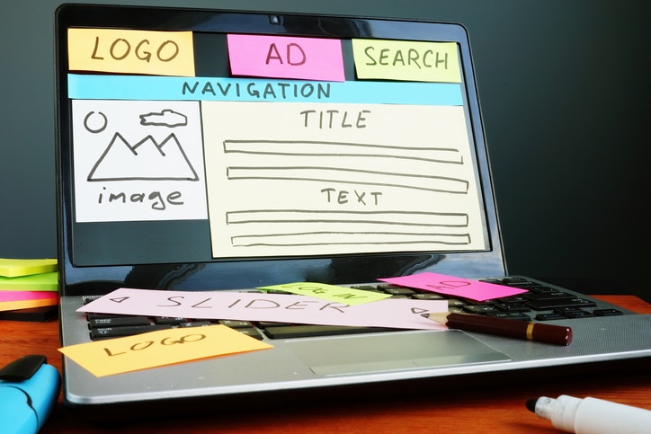
What are Wireframes?
Wireframes are essentially a blueprint or visual representation of a website or web application’s layout, structure, and functionality. They are typically created in the early stages of web development, before any actual design or coding work begins. Wireframes help to define the user experience and functionality of a website or web application in a simple, visual way that can be easily shared and reviewed by stakeholders.
Incidentally, Wireframes are called so because they were traditionally created using a framework of thin wires or lines to outline the basic layout and structure of a website or web application. These wires or lines were used to represent the various components of the website or web application, such as navigation menus, buttons, text blocks, and images.
Today, wireframes are typically created digitally using specialized software and tools, but the term "wireframe" has remained in use to describe the basic visual representation of a website or web application’s layout and structure. The name "wireframe" has become synonymous with this early stage of web development, and is widely used across the industry to describe the visual planning and prototyping of websites and web applications.
There are several reasons why you would want to create wireframes for your website or web application. First, wireframes provide a clear, visual representation of the layout and structure of your website or web application, which helps ensure that all stakeholders are aligned on the overall vision and direction of the project. Second, wireframes help to identify any potential issues or challenges with the user experience or functionality of your website or web application early on in the development process, before any significant time or resources have been invested. Finally, wireframes can help to streamline the development process by providing a clear roadmap for the design and coding work to come.
A web development company can be a valuable partner in creating wireframes for your website or web application. They have the expertise and experience to understand your business needs and translate them into a clear, visual representation of your website or web application’s layout and structure. They can also provide guidance and advice on best practices and industry standards, ensuring that your wireframes are built using the latest technologies and design trends.
Wireframes are an important tool to consider when starting a web development project. They provide a clear, visual representation of the layout and structure of your website or web application, which helps to align stakeholders, identify potential issues, and streamline the development process. A web development agency can help you create wireframes that meet your business needs and translate your vision into a clear, actionable roadmap for your web development project.
What are Website Mockups?
Mockups are visual representations of how a website or web application will look and function once it is built. They are created after the wireframes have been approved and provide a more detailed and realistic view of the final product.
A company would want mockups for a few reasons. Firstly, they provide a better idea of what the final product will look like, which can help stakeholders make more informed decisions and provide feedback early in the development process. Secondly, mockups can help identify potential issues or challenges with the design before development begins, saving time and money in the long run. Finally, mockups can be used to get buy-in from stakeholders, helping to ensure everyone is on the same page before development begins.
A website development company could be helpful in this area by providing expertise and experience in creating high-quality, professional-looking mockups. They will have a team of skilled designers who are familiar with the latest design trends and best practices, and can work closely with you to create mockups that accurately represent your vision and brand. Additionally, a web development company can provide valuable feedback and suggestions based on their experience working with other clients and their knowledge of industry standards, helping you create a mockup that is both visually appealing and functional.
What is QA Testing?
QA testing, or Quality Assurance testing, is a process of evaluating a website or web application to ensure that it is functioning correctly and meets the requirements and specifications that were set out during the planning and development phase. This involves testing various aspects of the website or web application, such as its functionality, usability, performance, security, and compatibility.
A company would want QA testing to ensure that the final product is of high quality and meets the needs of its users. QA testing helps to identify and address any bugs, errors, or issues with the website or web application, ensuring that it is reliable and easy to use. This can help to improve customer satisfaction and reduce the risk of negative feedback or reviews.
A web development company could be helpful in this area by providing a team of skilled QA testers who are experienced in testing websites and web applications. They will have a deep understanding of the testing process and will be able to identify and address issues quickly and effectively. Additionally, a website development agency can provide a fresh perspective on the website or web application, as they will not be as close to the project as the company’s internal team. This can help to identify issues or bugs that may have been overlooked during the development process. Overall, working with a web development agency can help to ensure that the final product is of high quality and meets the needs of its users.
Web development is the process of creating and maintaining websites and web applications. It involves a range of tasks, including custom web application development, ecommerce development, technical requirements, wireframes, mockups, and QA testing. Medium to large businesses require web development to enhance their online presence and to meet the needs of their customers. Hiring a website development company or agency can be helpful in this area as they have the expertise and experience needed to create high-quality, functional websites and web applications that meet the specific needs of the business. With the help of web development professionals, businesses can ensure that their online presence is optimized and their customers are satisfied, ultimately helping to achieve their business goals.
Webolutions is a full-spectrum marketing agency, management consulting and strategic growth implementation company. We help businesses across the country identify and effectively bring their unique stories to life, empowering them to scale faster, smarter and easier. We are experts in web development, and since 1994 we have provided website development services for hundreds of customers nationwide. How can we help you with your website development needs?
Web design is the art of creating the visual elements and layout of a website. It involves the use of various design principles, typography, graphics, and user interface techniques to craft an appealing and user-friendly digital presence for businesses, enhancing their online image and customer engagement.
Web development is the process of building and maintaining websites or web applications. It encompasses various technical tasks, including coding, programming, database management, and server configuration, to ensure a website functions correctly and delivers a seamless user experience.
Keep your website development strategy ahead of the competition with valuable industry insights
Sign up for our Accelerated Business Growth Insider and stay in the know.
Running a successful business has become more complicated and challenging than ever before. There are countless tasks and processes associated with your daily operations,…
Open AI recently announced a new AI text-to-video model named Sora, marking a significant leap in AI video editing technology. The video generator can…