95% of the information on the web consists of written language. After all, that’s what you’re doing now — reading. Successful visual communication hinges on good typography. With such a strong influence on usability, it stands to reason that typography should be one of the most considered aspects of web design. Typography is a huge field of study, with a limitless number of daunting complexities. From something as simple as knowing the difference between a serif and a sans serif (see below) to knowing the difference between metric and optical kerning, typography can be hard. Below I’ve illustrated, in my estimation, the three most basic tips to help you improve your web typography.
Choosing and Pairing Typefaces
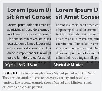
In 2008, web designers had 18 fonts to use. Nowadays, with the explosion of web font services like TypeKit, Google Web Fonts, and @font-face, designers have the ability to implement thousands of typefaces into their designs. The most integral consideration when working with typography is the style and family of font to be used. There are two basic styles: serif and sans-serif. Serif fonts have serifs or extra embellishments at the end of stokes (think of Times New Roman); some call them feet or tails, whereas sans serif fonts are without serifs (think of Arial); no extra details are found on the end of each letter.
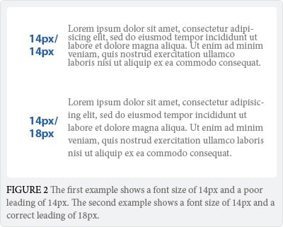
Leading (or line-height)
Go Big, REALLY BIG
When it comes to choosing web fonts, bigger is better. Always err on the side of making things bigger, and allow yourself to scale down if necessary. Most websites are crammed with tiny text that’s a strain to read, despite all browsers defaulting to a font size of 16px. Why? It’s just a collective mistake that dates back to a time when screens were really small. 16px is the text sizes browses were intended to display. Additionally, 16px text on a screen is about the same size as text printed in a book or magazine (accounting for the average reading distance of 20-23 inches from the computer screen). The more difficult your text is to read, the less of it a user will read–and the less of what a user reads, the less of your company message will be understood. 10px is illegible, 12px is still much too small, and even 14px can be a strain for many users.
Jeffrey Zeldman, web design rockstar and proclaimed “King of Web Standards” by Business Week, recently redesigned his website with the concept of huge typography in mind. Using 24px as the default size for the body copy, Zeldman explains “this version is designed for now. I love mobile for reading and I wanted to honor the concept of ‘mobile-first’ by pushing it possibly farther than a sane designer would.” While this is a stretch for many, Zeldman is certainly pushing the needle in the direction of large typography. Anything less than 16px with today’s modern monitors is a costly usability mistake.
I’ll be following this article with a Part two in the months to come, including more useful web typography tips.